
Никита Дубко
- Sofware Engineer в iTechArt;
- соорганизатор MinskCSS/MinskJS;
- адепт философии Pure CSS Images.
Мой путь
MinskCSS Meetup #1

CSS Magic Guideline
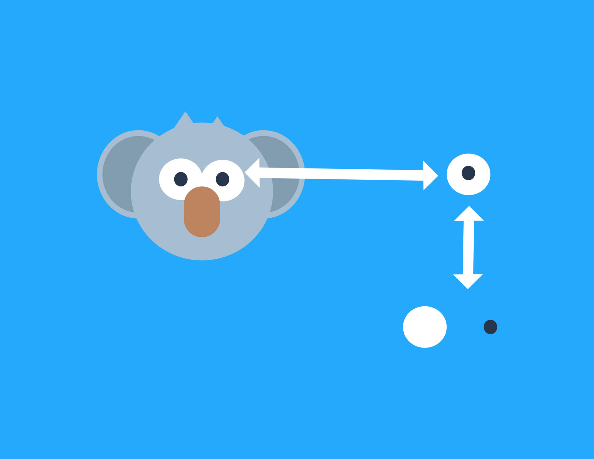
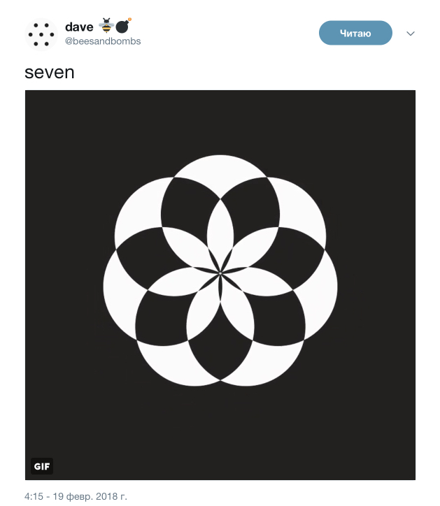
Наш мозг
любит обманываться
Слои, много слоев

Сколько стилизуемых элементов?
<div></div>
div {
    position: relative;
    border: 5px solid red;
}
div::before {
    border: 5px solid green;
}
div::after {
    border: 5px solid blue;
}
А если так?
<html>
    ::before
    <body>
        ::before
        ::after
    </body>
    ::after
</html>
Прямоугольник 1
div {
    width: 200px;
    height: 300px;
    border: 1px solid black;
    background: #f60;
}
Прямоугольник 2
div {
    width: 200px;
    height: 300px;
    border: 1px solid black;
    background: linear-gradient(
        transparent 25%,
        #f60 25%, #f60 50%,
        #60f 50%, #60f 75%,
        #6f0 75%
    );
}
background:
    background-image ||
    background-position [ / background-size ]? ||
    background-repeat ||
    background-attachment ||
    background-origin ||
    background-clip
Прямоугольник 3
div {
    width: 200px;
    height: 300px;
    border: 1px solid black;
    background:
        linear-gradient(#f60, #f60) 0 0,
        linear-gradient(#6f0, #6f0) 50px 100px,
        linear-gradient(#60f, #60f) 100px 200px;
    background-repeat: no-repeat;
    background-size: 100px 100px;
}
Прямоугольник 3.1
div {
    background:
        linear-gradient(#f60, #f60) 0 0 / 100px 100px
            no-repeat scroll padding-box border-box,
        linear-gradient(#6f0, #6f0) 50px 100px / 100px 100px
            no-repeat scroll padding-box border-box,
        linear-gradient(#60f, #60f) 100px 200px / 100px 100px
            no-repeat scroll padding-box border-box;
}
Эллипс 1
div {
    width: 200px;
    height: 300px;
    background: #f60;
    border-radius: 50%;
}
Эллипс 2
div {
    width: 200px;
    height: 300px;
    background:
        radial-gradient(
            #f60 0, #f60 70%,
            transparent 70.1%
        );
        /* a^2 + b^2 = c^2 */
}
Эллипс 3
div {
    width: 200px;
    height: 300px;
    background: #f60;
    clip-path: ellipse();
}
Треугольник 1
div {
    width: 0;
    height: 0;
    border: 100px solid transparent;
    border-left-width: 200px;
    border-bottom-color: #f60;
    border-top-color: #6f0;
    border-left-color: #60f;
    border-right-color: #06f;
}
Треугольник 1.1
div {
    width: 0;
    height: 0;
    border: 100px solid transparent;
    border-left-width: 200px;
    border-top-width: 0;
    border-bottom: 300px solid #f60;
}
Треугольник 2
div {
    width: 200px;
    height: 300px;
    background:
        linear-gradient(
            to right top,
            #f60 50%, transparent 50.1%
        );
}
Треугольник 2.1
div {
    width: 300px;
    height: 300px;
    background:
        linear-gradient(
            to left top, #06f 50%, transparent 50.1%
        ) 0 0 / 200px 100%,
        linear-gradient(
            to right top, #f60 50%, transparent 50.1%
        ) 200px 0 / 100px 100%;
    background-repeat: no-repeat;
}
Треугольник 3
div {
    width: 200px;
    height: 300px;
    background: #f60;
    clip-path: polygon(
        66.666% 0%,
        0% 100%,
        100% 100%
    );
}
border-radius
div {
    border-radius: 50%;
}
.egg {
    border-radius:
        100px 100px 100px 100px /
        200px 200px 100px 100px;
}
box-shadow
div {
    width: 200px;
    height: 200px;
    border-radius: 50px;
    border: 5px solid #06f;
    background: transparent;
    box-shadow:
        50px 50px 0 0 #f60,
        -50px 100px 0 50px #0f6,
        inset 10px 10px 0 30px #f06;
}
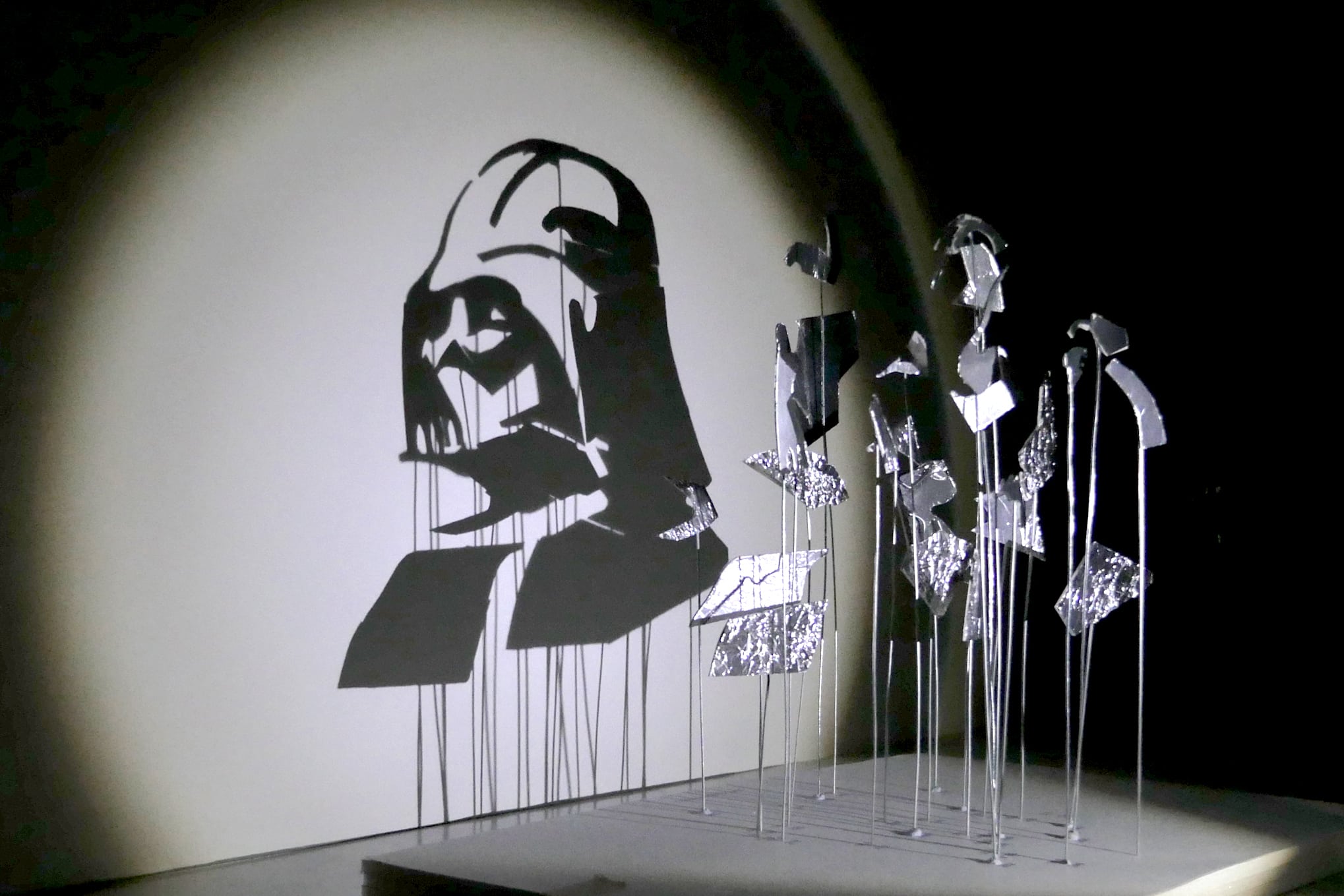
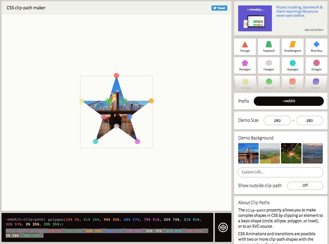
clip-path (читерство)
div {
    width: 200px;
    height: 200px;
    background: #f60;
    clip-path:
        polygon(
            50% 0%, 61% 35%, 98% 35%,
            68% 57%, 79% 91%, 50% 70%,
            21% 91%, 32% 57%, 2% 35%, 39% 35%
        );
}
Инструменты CSS-волшебника 🧙♂️
- ::before, ::after
- background
- border-radius
- box-shadow
- clip-path (для темных магов)
Что дальше?
animation
- animation-name: none
- animation-duration: 0s
- animation-timing-function: ease
- animation-delay: 0s
- animation-iteration-count: 1
- animation-direction: normal
- animation-fill-mode: none
- animation-play-state: running
3D
Куб (HTML)
<div class="cube">
    <div class="cube__face"></div>
    <div class="cube__face"></div>
    <div class="cube__face"></div>
    <div class="cube__face"></div>
    <div class="cube__face"></div>
    <div class="cube__face"></div>
</div>
Куб (CSS)
.cube__face {
    transform:
        rotate3d(var(--i), var(--j), 0, calc(var(--m) * 90deg))
        translateZ(calc(.5 * var(--cube-edge)));
}
.cube__face:nth-child(1) { --i: 0; --j: 1; --m:  0; }
.cube__face:nth-child(2) { --i: 0; --j: 1; --m:  1; }
.cube__face:nth-child(3) { --i: 0; --j: 1; --m:  2; }
.cube__face:nth-child(4) { --i: 0; --j: 1; --m:  3; }
.cube__face:nth-child(5) { --i: 1; --j: 0; --m:  1; }
.cube__face:nth-child(6) { --i: 1; --j: 0; --m: -1; }
Как ускориться?

Правильные инструменты
 Emmet
Emmet
ol.list>li.list__item*4>a<TAB>
<ol class="list">
    <li class="list__item"><a href="http://"></a></li>
    <li class="list__item"><a href="http://"></a></li>
    <li class="list__item"><a href="http://"></a></li>
    <li class="list__item"><a href="http://"></a></li>
</ol>
Emmet
posa
w100
h50
bg#0
position: absolute;
width: 100px;
height: 50px;
background: #000000;
Зачем?

1. Эксперименты
2. Опыт

3. Понимание нюансов

С чего начать?

Этапы построения магии на CSS
- Идея 💡
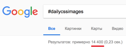
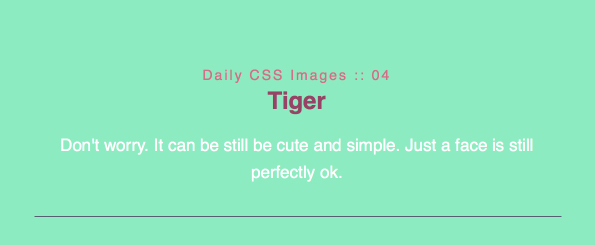
#dailycssimages
#codepenchallenge
#100daysofcode
Этапы построения магии на CSS
- Идея 💡
- Сценарий 🎬
- Сетка ⬜
- Слои 🔳
- Анимации 📽️
- Детали 🔍
- Поделитесь с миром 🌍
8. Ждите


